Exploring Data in Reports
This page introduces you to data exploration with Explore. From this page, you’ll understand where to start pulling data, how to modify a report to see more detail, and how to drill down to gain deeper insights.
Explores Are the Starting Point for Exploration
The Explore page presents a number of Explores for looking at your security data.
You can choose to view data from three different areas: Alerts, Application Events, Cloud Firewall Events, Page Events, Network Events, Transaction Events, and Incidents. The data collection you see in your account may vary depending on your Advanced Analytics license.
Select a data collection to explore from the Data Collection dropdown in the upper right corner of the window.
The data shown in an Explore is determined by the dimensions and measures you select from the field picker at the left. A dimension can be thought of as a group or bucket of data. A measure is information about that bucket of data. Dimensions appear as blue columns and measures appear as orange columns in your data table.

Sorting Data
Data on the Explore page is sorted by default based on the following prioritization:
The first date dimension, descending
If no date dimension exists, the first measure, descending
If no measure exists, the first added dimension, ascending
The data shown in an Explore is determined by the dimensions and measures you select from the field picker at the left. A dimension can be thought of as a group or bucket of data. A measure is information about that bucket of data. Dimensions appear as blue columns and measures appear as orange columns in your data table.
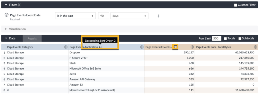
However, you often may want to sort data differently. Clicking the column header will sort from highest to lowest. You can sort by multiple columns by holding down the Shift key, then clicking on the column headers in the order you would like them sorted.
In addition, columns in the data table in Explore queries show helpful hints when users add multiple sort orders. This allows users to see the order in which sort orders are executed as well as any limitations that may be present.

Note that if you reach a row limit, you will not be able to sort row totals or table calculations.
Pivoting Dimensions
Multiple dimensions are often easier to look at when you pivot one of the dimensions horizontally. Each value in the dimension will become a column. This makes the information easier to consume visually, and reduces the need to scroll down to find data. New Reports support up to 200 pivoted values.
To pivot a dimension, click PIVOT for that dimension. Before running the report, be sure that you also have included at least one unpivoted dimension and at least one measure. You can pivot additional dimensions as desired, but must always include at least one unpivoted dimension.
If there is no row of data whose value would appear in a column, that is indicated with the null value symbol, a zero with a slash across.
You can also sort pivoted dimensions by clicking the title of the dimension. To sort by multiple pivoted dimensions, hold down the Shift key, then click on the dimension titles in the order you would like them sorted. When sorting a pivoted measure, any rows with values in that column are sorted first followed by rows without data in that column (indicated by the null value symbol).
Reordering Columns
You can reorder columns in the Data section by clicking on a column header and moving the column to its desired position. The Explore’s visualization will reflect the new column order after you click Run.
Columns are organized in the Data section by field type: dimensions, dimension table calculations, measures, measure table calculations, and row totals. For the most part, columns can be reordered within each field type but cannot be moved out of their field type section. For example, dimension table calculations can be rearranged among themselves, but you cannot place a dimension table calculation in between two measures. One exception, however, is that you can use the arrow next to the row totals checkbox on the Data tab to move the row total column from the far right of the data table to just after the dimension table calculations.
Columns under a pivoted dimension can be reordered, but the order of pivoted dimensions can be changed only by changing the sort order, not by manual reordering.
Removing Fields
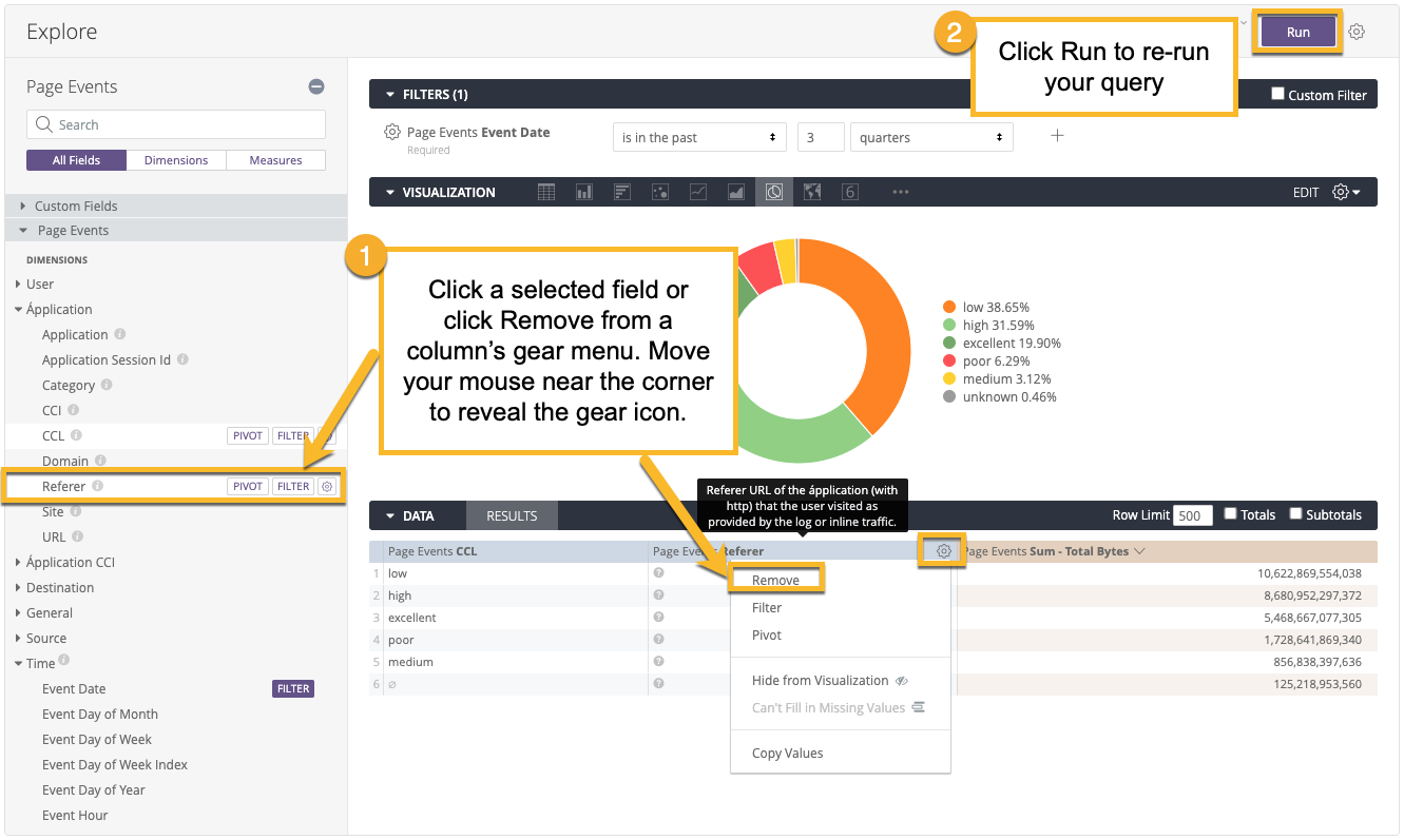
You can remove a field from your Explore by clicking the selected field in the field picker or by choosing Remove from the column’s gear menu:

You can also remove all fields in an Explore using the keyboard shortcuts Command-K (Mac) or Ctrl+K (Windows). Once you have removed fields, click Run to get the new report results.
Displaying Totals
Sometimes a summary of your data is useful. You can add column totals to your report by clicking the Totals checkbox in the upper right, then running the report:
You can also add row totals to your report, but only if you’ve added a pivot to your report:
If you’ve added row totals, and your report exceeds any row limit that you’ve set, you will not be able to sort the row totals column (although you can sort dimension and measure columns as normal). This is because you might be missing rows in your data that should be included in your totals. If you run into this issue, you can try increasing your row limit (up to 5,000 rows).
Additionally, there are some things to keep in mind about how totals work in certain situations:
Columns that count unique items might not add up as you expect, since the same item might show up in several categories, but only be counted as one unique item in the totals.
Some table calculations that perform aggregations, such as calculations using percentile or median, might not add up as you expect. This is because table calculations calculate totals using the values in the total row, not using the values in the data column.
If you’ve filtered your report by a measure, totals may appear to be too high. However, in actuality, what you’re seeing is a total for your data before the measure filter is applied. In other words, the measure filter may be hiding some data from your report, even though that data is included in the total.
If you’ve used totals with merged results, the system calculates totals on each of the component reports and uses those totals in the merged result. Therefore, totals may appear too high, because what you are seeing are totals calculated before the results were merged. One way to avoid this is to align the filters on each report.
Similarly, if you’ve placed row or column limits on your report, and your report exceeds that limit, totals may also appear to be too high. However, what you’re seeing is a total for your data before the limits are applied. In other words, the limits may be hiding some data from your report, even though that data is included in the total.
Copying Values
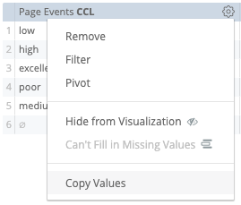
You can copy all the data from a table column. To do so, hover over a column label, click the gear icon, and then choose Copy Values:

This data can then be pasted into a document or a tool like Excel.