Forecasting in Visualizations
Admins can use forecasting in visualizations to quickly add data projections to new or existing Explore queries to help predict and monitor specific data points. Forecasted Explore results and visualizations can be added to dashboards and saved.
The Forecast feature uses the data results in an Explore's data table to calculate future data points. Forecast calculations include only the displayed results of an Explore query; any results that are not displayed because of row limits are not included.
Forecasted results display as a continuation of existing Explore visualizations and are subject to configured visualization settings.
Forecasted data points are distinguished from non-forecasted data points in the following ways:

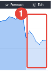
In Cartesian charts, forecasted data points are differentiated from non-forecasted data points by rendering in a lighter shade or by dashed lines.
In text and table chart types, forecasted data points are italicized and appended with an asterisk.
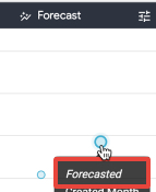
Forecasted data is also explicitly identified in the tooltip that appears when you hover your cursor over a forecasted data point:

Only certain types of visualizations support forecasted data, as discussed in the following section.
SUPPORTED VISUALIZATION TYPES
The following Cartesian visualization types support rendering forecasted data:
Column
Bar
Scatterplot
Line
Area
The following text and table chart types support rendering forecasted data:
Table
Single record
Other visualization types, including custom visualizations, cannot currently render forecasted data.
To learn more: Visualization Types, Supported and Unsupported Visualization Types