Creating Reports (Dashboards)
You can organize visualizations onto dashboards, combining tables and charts in useful and interesting layouts.
Overview
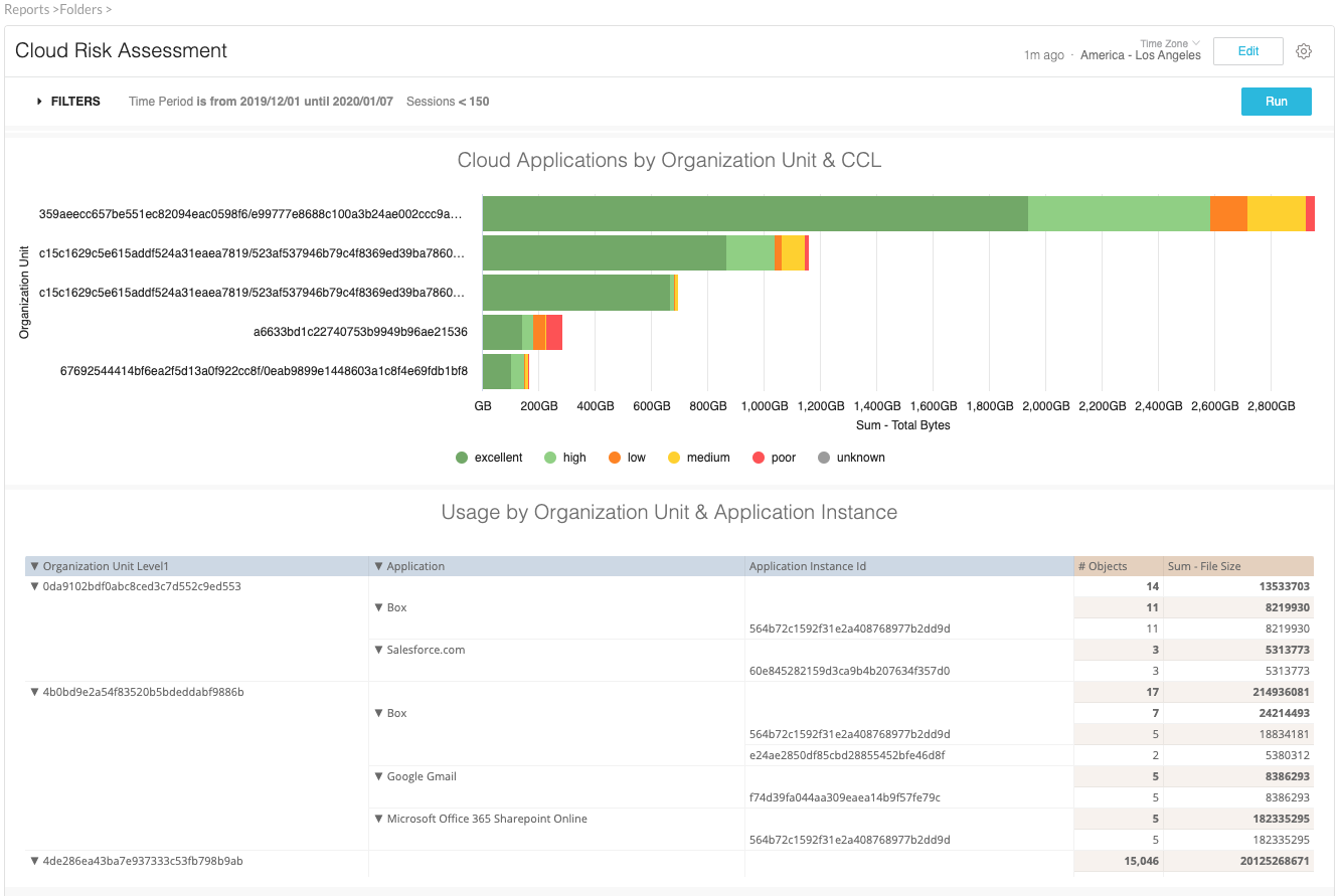
A dashboard is essentially a collection of visualizations of reports, displayed all on one page. You can add filters to make the dashboard interactive and rearrange its tiles. After you’ve configured a dashboard to your liking, you can share it with your team. You can create as many dashboards as you like and can tailor each dashboard to the specific needs of the users.

From the perspective of creating dashboards, there are three general types of tiles:
Report tiles
Linked tiles
Text tiles
Report Tiles
You can explore to get the report for a report-based tile.
The report of the report tile belongs to the dashboard. Even if you use an existing widget to create a report tile, the widget is only used during the creation of the report tile. The tile is unaffected by any later changes. The report tile will still exist independently on the dashboard even if the widget is deleted.
When possible, use a report tile to avoid cluttering up your folders with unnecessary widgets.
Widgets
A widget is a good choice if you want to create, change, and test a report in one place but use it in multiple dashboards.
The widget and the dashboard must be in the same folder. If the widget is changed, the changes to the widget will show in your dashboard. If the widget is deleted, the dashboard will show an error for this tile.
Text Tiles
A text tile does not have a report. You can use text tiles to add headers and text to your dashboards. Often text tiles are used to make visual sections on a dashboard or add descriptions as needed.
You can specify one or more of these choices: a title, subtitle, or body text.
Creating Dashboards
There are several ways to start the creation of a dashboard:
Create a blank dashboard, then add tiles (report tiles, widgets, or text tiles).
Start from a widget, then add its report to a new dashboard as either a report tile or as a widget.
Start from a report on the Explore page, then add its report as a report tile on a new dashboard.
Warning
Think about the number and complexity of elements that you add to a dashboard. More elements require more browser resources, which increases dashboard rendering time. If rendering becomes an issue, consider creating multiple dashboards with fewer elements.
Editing Dashboards
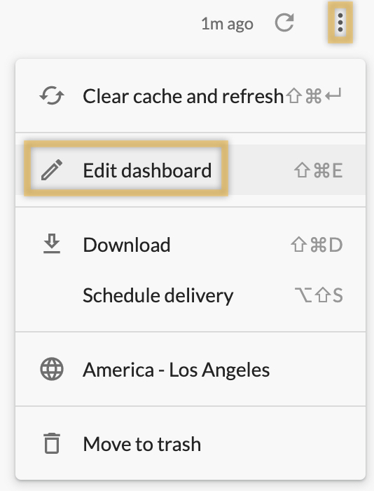
Select Edit dashboard from the dashboard menu:

In edit mode, you can add, move, edit, or delete tiles or filters, or edit the dashboard title.
You can tell that you're in edit mode by the blue toolbar at the top of the dashboard.

As you begin to make edits, the Save button appears. Click Save to save your edits and exit edit mode.
To discard edits, click Cancel. In the Discard changes? dialog box, click Discard to confirm that you want to cancel and exit edit mode. The Discard changes? dialog box also appears if you attempt to navigate away from the dashboard by clicking on the navigation breadcrumb or the forward or back arrows on your browser.
While in edit mode, dashboard creators can select the option to move a tile to the top or bottom of a dashboard.
Rearranging and Resizing Tiles
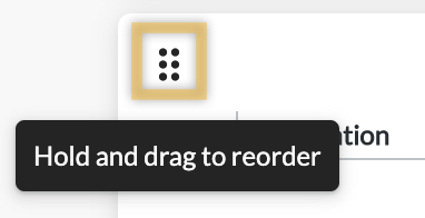
In edit mode, you can move and resize tiles on a dashboard. Click and drag on the six-dot icon in the upper left of a tile to move it. When you drag a tile to a new location on the dashboard, blue grid lines appear to help you position the tile.

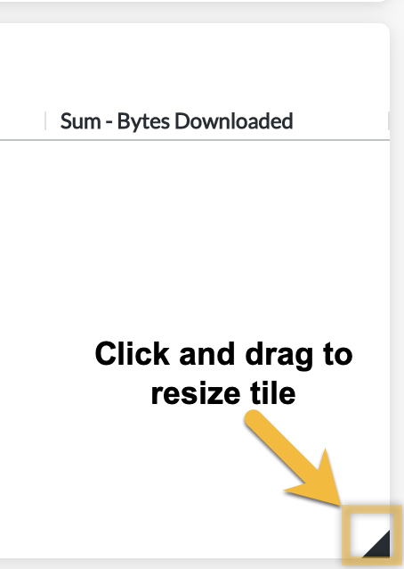
Click and drag on the bottom right corner of the tile to resize it.

If you want to resize a tile to be very short, hiding the tile title can help you make the tile as short as possible.
You can also use the Move tile option in the tile's edit menu to move the tile to the top or the bottom of the dashboard.
Tile Size and Grid Layout
When you add a visualization using grid layout to a dashboard, the grid arrangement can become responsive to the size of the dashboard tile.
For example, you have a dashboard tile with a visualization that uses a grid layout of four small charts. If you size the tile to be short and wide, the small charts appear as one row of four. If you size the tile as a square, the small charts reposition to two rows of two. If you size the tile to be narrow but tall, the charts reposition to four rows of one.
To ensure that the grid arrangement is responsive, do not enter a number into the visualization's Number of Charts per Row setting. If you enter a value into Number of Charts per Row, the dashboard tile respects that setting regardless of the size or shape of the dashboard tile.
To learn more: Netskope Library