Using Google Maps in Visualizations
Google Maps charts let you visualize geographic data on responsive and interactive maps, and they provide significant control over the way that map points are plotted. Google Maps charts have similar functionality to the Map chart visualization type.
To learn more: Visualization Types, Supported and Unsupported Visualization Types
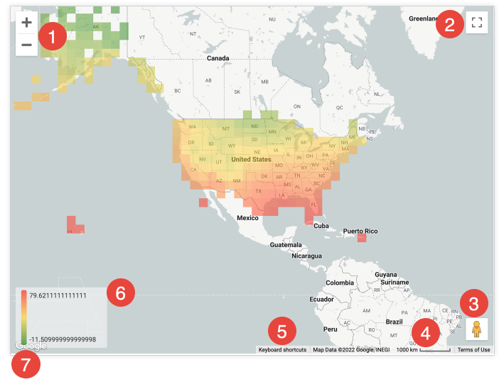
When users view a Google Maps chart, several icons appear on the chart that let them interact with the visualization.

Zoom in and Zoom out icons: Click the + icon to zoom in and the - icon to zoom out on the map view.
Toggle fullscreen view icon: Click the Toggle fullscreen view icon to expand the map to fullscreen. Press the esc key on your keyboard or click the icon again to return to standard view.
Drag Pegman onto the map to open Street View: Drag the Pegman icon to any location on the chart to switch the map to Street View for that location. Click the back arrow at the upper left of Street View to return to the chart.
Distance scale: At the bottom of the chart, there is a scale in meters or kilometers for the current view of the map.
Keyboard shortcuts: Click Keyboard shortcuts at the bottom of the chart to see a window with available keyboard shortcuts for interacting with the chart.
Value color scale: If measures are plotted on the chart, a color scale appears at the the bottom left of the chart to indicate the range of colors between the minimum and maximum values. The settings in the Value menu can affect the appearance of the value color scale.
Open this area in Google Maps: Click the Google logo at the bottom left of the chart to open the map in Google Maps. Google Maps opens in a new browser tab.
BUILDING A GOOLGE MAPS CHART
A dimension based on latitude and longitude data.
A dimension with a map layer assigned to it.
A zip code dimension, which automatically has a US zip code map layer assigned to it.
Limit the precision of latitude and longitude data coordinates to no more than five to six decimal places. If coordinates exceed seven decimal places, the map will not display any data points.
To build a Google Maps chart, select the Google Maps visualization type in the Visualization bar. You can also edit your map visualization in the visualization menu. Click Edit in the upper right corner of the Visualization bar.
Tip
The options described on this page are available in the different tabs of the Edit menu. Options may be grayed out or hidden if they conflict with other settings that you have chosen.